7.05.2007

Blush Blossom & Sage Shadow


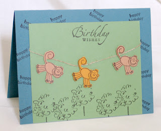
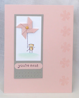
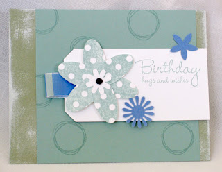
I recently joined a swap in which I had to use a specific SU! color. (I chose Blush Blossom and Sage Shadow as you can see above.) Blush Blossom is a very faint pink.. it isn't as powerful as Pretty in Pink, which is a little too girly for me. I thought the "You're Neat" stamp set would work wonderfully with this subtle color because of its simple line images. I was dying to try out some stamps from the SU! Preview Brochure a couple weeks ago, so I decided to use Pick a Petal for the Sage Shadow cards. I wanted to incorporate colors from the Seaside Ribbon Originals. (I didn't realize they were going to be discontinued at the time.) All in all, I think both turned out ok. It was a bit time consuming making the tiny pinwheels for the Blush Blossom cards and assembling the 6-petal flowers for the Sage Shadow cards.

6.26.2007

Fall-Winter Savvy Swap: Entries #1-4

The following cards feature different stamp sets from Stampin' Up!'s Fall-Winter Preview Brochure. Take a look at all the wonderful entries!

Entry #1: Connie Tumm

______________________
Entry #2: (Best of Show) Janice Warhank

______________________
Entry #3: Liz Ketter

______________________
Entry #4: Kym Arter

Fall-Winter Savvy Swap: Entries #5-7

Entry #5: Lindsey Blackhurst


Top View:


______________________
Entry #6: Lindsey Blackhurst


Inside Card:


______________________
Entry #7: Kristi Froeber

Fall-Winter Savvy Swap: Entries #8-10

Entry #8: Dawn Burnworth


Different View:


______________________
Entry #9: Kristi Froeber


______________________
Entry #10: Lisa Jimenez

Fall-Winter Savvy Swap: Entries #11-14

Entry #11: Judy Mummau


Different View:


______________________
Entry #12: Jan Cooper


______________________
Entry #13: Kris Rimbos


______________________
Entry #14: Shannon Gill

6.17.2007

Sneak Peek: Pick a Petal


Pick a Petal is one stamp set you'll find in SU!'s Fall-Winter Preview Brochure. There are 6 petal designs, 4 circles/centers, and 1 small flower in the set. It's a great set because SU! will also offer coordinating On Board (chipboard) accents! I used all SU! products, except the background paper (from My Mind's Eye).

6.13.2007

What's so Groovy about Guava?

It's not pink, orange or peach. It's more mellow than Stampin' Up!'s Cameo Coral (for those who are skeptical). It makes me think of late spring/early summer. It can be wild and tropical if you team the color up with animal stamps, animal prints, fruit or tropical scenes. It can be flowery or feminine. It can be used in a wide variety of color combos. Here are a few:

Groovy Guava + any of the New SU In Colors 2008
Groovy Guava + Chocolate Chip + Certainly Celery
Groovy Guava + Bravo Burgundy + Close to Cocoa
Groovy Guava + Brocade Blue
Groovy Guava + Barely Banana
Groovy Guava + Perfect Plum

Groovy Guava is a great pick-me-up color that is not as intense as any colors in the Bold Brights family and not as soft as the Subtles. I love the color about as much as I love the fruit. I may not be able to get the fruit year-round, but at least I'll be able to get Groovy Guava for a whole Stampin' Up! year!

6.11.2007

Faux Metal Technique

I think this technique is for an intermediate-level stamper.. for sure, it is a little more time-consuming than directly stamping on paper and you may need to try it a couple times before getting the desired effect. For the cards in my post below, I first placed my paper on top of a large piece of scrap paper and daubed my Versamark Pad (until the surface was completely covered). Then, I sprinkled copper embossing powder over the entire surface and heat embossed it. I repeated this two more times. As the saying goes: "The third time's the charm." On the third layer of embossing powder, I kept my heat tool above the piece until I was sure the entire surface was still hot. I immediately stamped onto the embossed surface, before the layer hardened. I left the stamp on the surface for about 5 seconds before removing it. On one faux metal piece, the image did not come out clear... so I inked it up again and added a 4th layer of embossing powder. When it was reheated, the old image melted down and I was able to stamp my image again... it was much better!

6.10.2007

More Artfully Asian Cards


Here are three more samples of cards I created as a birthday gift for one of my coworkers. I need to find a better way to photograph samples because these photos do not justify the work. The colors are off... they are taken indoors with poor lighting conditions.

6.07.2007

Artfully Fun

Today, my coworkers and I celebrated a couple of birthdays for June. One of my coworkers is a tool junkie, so I HAD to get her the Stampin' Up! 4-piece cutting tool... it has a perforator, cutter, scoring tool & 7-sided paper distresser. I could be wrong, but I believe the cutting/distressing product first started with Tonic Studios. The company has a whole line of well-designed cutting and crafting tools. Tonic Studios has cushioned grip scissors that are easier on hands. If you spend several hours cutting and crafting, believe me, it makes a bit of a difference!


I created a set of greeting cards with "Artfully Asian" for the other birthday girl. Even though I stamped and heat embossed a couple images at a time, there were some slight variations. I often prefer to work better intuitively. I cut out the main images, created a second layer or "mat" for some and played with different pieces before deciding how to make each composition. Here's my color scheme: Elegant Eggplant, Perfect Plum, Mellow Moss, Sahara Sand and Bravo Burgundy. I used Hodgepodge Hardware, hemp twine and grosgrain ribbon for added flair. Surprisingly, it didn't take much time to pierce a straight row of little holes using SU's piercing guide and mat. I may just start using it more often! Here are 3 samples for now... more to come!

6.05.2007

Cool Caribbean

I was very lucky to meet some new friends at the Virginia Beach Stampin' Up! Regional.. They were very welcoming and we all sat at the same table for the presentations and projects. I had brought several little plastic boxes with lids that were SO close to Cool Caribbean. I didn't get a chance to decorate them myself, but offered them to some of my new friends. This is one from Jennifer Einolf of VA: Summer Box. Here is another one by Amber Nelson. Those who have grown to love Cool Caribbean, one of the 2007 In Colors, will be rather disappointed that it will soon be retiring. The closest possible color will be the new Soft Sky (2008 In Color)... however, it is lighter and seems to have a slight tint of green.

6.02.2007

Four-Panel "Note"


Here's a sneak peek at one of the sets coming out in Stampin' Up!'s new catalog. It is called "Double-line Doodles." I attended one of the Virginia Beach Regionals a little over a month ago and received the set. This little four-panel card was one of the make-and-take style projects we created. The tiny note holder was created by sealing a small envelope, slicing a bit of the end off and using a circle punch to make the semi-circle opening at the top. It's a cute way to hide a tiny message. The colors used to make this card are: Certainly celery, Old Olive, Real Red, More Mustard, Tempting Turquoise. Ribbon: Red gingham, Celery grosgrain & Hemp twine.

5.30.2007

Goodbye Balmy Breezes


Here are two simple layouts created with SU!'s "Balmy Breezes" set. The images in this set are great for stamping on top of each other and creating a "weathered" look. For the top sample, I used Really Rust and Always Artichoke craft spots to daub color on the pineapple. I attached the tag with hemp twine onto one of the horizontal stripes of the card. It was an easy way of adding a "layer" without using dimensionals or pop-up glue dots. On the bottom card, I stamped the pineapple on Very Vanilla cardstock and added a layer each of Really Rust and Close to Cocoa. Plain twill tape complements the muted colors and sort of "rugged" feel of the card. The twill tape is secured with Aged Copper brads.

"Balmy Breezes" (along with a vast majority of other sets) will soon retire from Stampin' Up!. It is a bit shocking that some well-designed sets will no longer be offered... but it means that there are more new stamps to look forward to. Stampin' Up! will soon unveil the first of its semi-annual catalogs to customers in July: The Fall-Winter Catalog. I'm looking forward to seeing what's in store then. As it is, SU! offers a great line of stamps and color-coordinated accessories. They are well worth the wait! Check out the SU! site for updates: www.stampinup.com

5.26.2007

Joann.com Sale!

Need I say more?! Stop on by (www.joann.com) to get 50% off one regular-priced item! Unfortunately, there are a few brands that aren't included.. but hey, it's worth taking a peek! I bought a Marvy Uchida Mega Scalloped Oval with a discount... it will be great layering with the Giga Scalloped Oval.

Now I'm keeping my eyes peeled for the handy dandy Crop-a-Dile. I have several containers of eyelets sitting around. It would be nice to put them to good use! I love the fact that you can punch holes AND set eyelets or snaps with one tool. I'm sure I am not the only one who stays up until wee hours at night. Who wants to wake up to the sound of hammering or spring-loaded eyelet pounding?

5.25.2007

Crafty with Clearsnap

When I read posts on forums or blogs, I'm surprised that many people seem to prefer dye-based ink over pigment ink. The main advantage of dye-based ink is that it dries instantly. However, when it comes to rich color and blending possibilities, Pigment (a.k.a. Craft) ink works best in my experience. Dye inks are absorbed by the type of cardstock people often use. Sometimes, there is a "bleeding" effect that makes stamped images "fuzzy." As long as I apply an even coat with pigment ink, the image looks neatly stamped. One tip to evenly coat a stamp is to gently tap it on a pigment/craft pad. Keep in mind that the "spongelike" pigment pads do not require as much pressure to ink a stamp as the tougher dye pads. Ink from pigment pads adhere readily as well as transfer easily. If I feel like blending colors or having a "rock and roll" type of effect, I simply daub other colors on a stamp with Clearsnap cat's eye pads or Stampin' Up! craft ink spots. I start with lighter colors (ie. yellow) and work my way to darker colors (ie. red). It's a great way to achieve a multicolored image without using markers or colored pencils to manually add colors. Best of all, pigment ink is easier to clean off than dye ink! You can just use water and give the stamp a good scrub.

"So what does this have to do with Clearsnap?" you may ask. Ever since I was a gradeschooler, I used Colorbox inkpads and Color Cubes when I stamped. I once saved as much money as I could and bought one or two color families worth of pigment ink pads. For a little kid, it was crazy! If you take a look at the wide variety of colors that Clearsnap offers, it would be difficult to list ones they lack. There is more variety than ever with hybrid "chalk" inks, mica, metalextra... and inkpad options varying from Cat's eyes and Queues to Paintboxes and Petalpoint pads. Besides ink, the company carries its own line of interesting stamps. Which came first? ...the Rollagraph or the Stampin' Around? But stampers have gotta hand it to Sterling and Shelli Gardner for acquiring the company in 2006. (Check out http://www.stampinup.com/au/ena/3860_3863.asp) What more could stampers want than to be able to coordinate their inks with paper and accessories in Stampin' Up!?

5.23.2007

Asymmetrical Layouts

Synonyms to the term "asymmetric" are: shapeless, oblique, cockeyed, unequal, uneven, unbalanced... but I prefer the general term: different. There are too many things people have to balance in life--checkbooks, eating habits, work and play--but it's nice to squeeze in as much fun as we can. When I design cards, I try to keep in mind how the type, imagery and supporting elements interact with each other, as well as how they create a visually pleasing composition. I love seeing designs in books or websites that have wonderful layouts. They break the monotony of all else.


Today, I have an A2 card (One quarter of an 8.5" x 11") and a trio of 3" x 3" mini cards (which fit perfectly in Stampin' Up! mini square envelopes). All were created with the Polka Dots & Paisley set. Some of the backgrounds were made with the coordinating Polka Dots & Petals set. I cut out different elements from the Petals & Paisleys designer series paper: the tiny paisleys and the stems of some flowers. To add a leaf to the flower on the A2 card, I used my stampin' write marker to color in one of the petals of the "outlined flower" stamp. I tried two ways of creating scalloped edges: first, I used sticky strip along the edge of one card and adhered a row of 1/2" punched circles... then, for one of the 3" x 3" cards, I carefully punched a row of slits. This is one of my favorite punches of all time. It was the first one I purchased from SU! because I knew there were many possibilities. In time, I grew to like many of the others as well.

5.21.2007

Swap Samples


This is from my very first swap. For those who haven't swapped before, each participant turns in a set number of cards (or card fronts) in the same design. The swap coordinator receives the cards/fronts and makes sure each participant gets one of each unique design. Then the packages are mailed back to each of the participants.

After I sent my package, I was anxious to see what everyone else made. It was so much fun receiving them in the mail. The best part is that, even though people may use the same stamp set, they make totally different cards.

The seashell is from one of my favorite Stampin' Up! sets in the 2006-07 catalog... "Beautiful Beach." I wanted to use a combination of sage shadow and bravo burgundy. The vintage brads and "distressed" look of the spring showers paper from SU! added to the look.. "Happy Birthday" is from the hostess set, Warmest Regards and the swirls are from Finest Flourishes. I think Finest Flourishes has been taken for granted. I haven't seen many cards, scrapbook pages or items utilizing the set. The images add an elegant, aged texture.


This is a more recent card for another swap. I actually wanted to do more layering or add more "umph" but time flew and before I knew it, I had to mail them! I had to make about 36 in all, so it was a bit time consuming. I used the "Simply Said" set, apricot appeal, bashful blue, certainly celery, cranberry crisp and whisper white cardstock, apricot appeal, bashful blue and chocolate chip classic ink, whisper white craft ink on the heart shape, and the spring bouquet punch.

4.10.2007

Layout Time


Lately, I've had a lot of ideas running through my head. I just started mapping a few out on the computer. Who knows, if you ever get "stuck" or run out of ideas, they may come in handy. The color schemes and elements can always be changed. Color schemes: left-Close to Cocoa, Pale Plum, Certainly Celery; center-Bashful Blue, Barely Banana, Ruby Red; right-Bravo Burgundy, Brocade Blue, Whisper White

4.07.2007

Recent Creations


This was created with the Beautiful Beach SU! set, Sage Shadow and So Saffron cardstock, On Board accents, Vintage brads, Taupe grosgrain and a variety of craft Stampin' Spots. The rough edges were created with the distresser (that comes with the cutter kit). Different textures were created by tearing and crumpling paper. Afterwards, the craft spots were daubed directly on the surface.


In a lighter, minimalistic style, I created this birthday card for one of my co-workers. Parlez-vous Français? set, Certainly Celery, Bravo Burgundy, Bashful Blue and Whisper White cardstock, Vintage brads, Seaside Ribbon Originals, Basic Black ink and Watercolor pencils. The only non-SU! tool used is the Giga Scalloped Square punch by Marvy Uchida. (I bought it a week ago and HAD to try it out!)

Just the Beginning

How would one ever know something existed? A thought lasts only in the mind of the creator--however long it remains there... hidden in the crevices of the brain or perhaps some wild imagination that only the Creator would understand. For a long time, proof of people's thoughts, ideas, stories and art have been written or recorded in some tangible form. Nowadays, more and more people have access to the wonderful, mysterious and vast realm of the World Wide Web. Instant access. Why not instant publication? With blogging, granted.

Now it is the beginning of the blog record of my stamping hobby-turned-business.